When Information Becomes Identity
- by kirillar780dev
- in Creative
- posted November 14, 2017
Most public information is designed to be read.
The best information is designed to be remembered.
Cities are full of directories, maps, plaques, and signage systems that serve a function but rarely leave an impression. They communicate information efficiently, yet often disappear into the background.
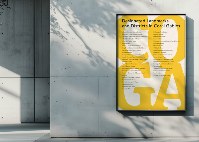
For this Coral Gables project, the challenge wasn’t simply organizing a list of designated landmarks and historic districts.
The challenge was creating recognition.
The information itself was already valuable. The question became: how do you make people notice it?
Rather than treating the landmark list as a block of text, I used oversized typography as the foundation of the composition. The letterforms operate at two scales simultaneously. From a distance, they create a bold graphic presence that attracts attention. Up close, the viewer discovers the detailed information layered within the design.
The result is both functional and memorable.
That’s where I think many communication projects succeed or fail.
Design isn’t just about making information accessible. It’s about giving information presence.
Without that presence, important messages get ignored. They blend into the visual noise people encounter every day.
Good design helps people find information.
Great design makes them want to engage with it.
Whether I’m designing a brand system, campaign, publication, or environmental graphic, the goal is the same:
Turn information into attention.
Turn attention into meaning.
Because communication only works when people notice it first.
Comments
Randall3338
June 3, 2026 at 7:08 amhttps://shorturl.fm/sE2ws
Jasmine3167
June 3, 2026 at 10:14 pmhttps://shorturl.fm/C1Vfc
Gideon4601
June 6, 2026 at 12:48 amhttps://pesnimp3.net