From Portfolio to Public Art
- in Public Art
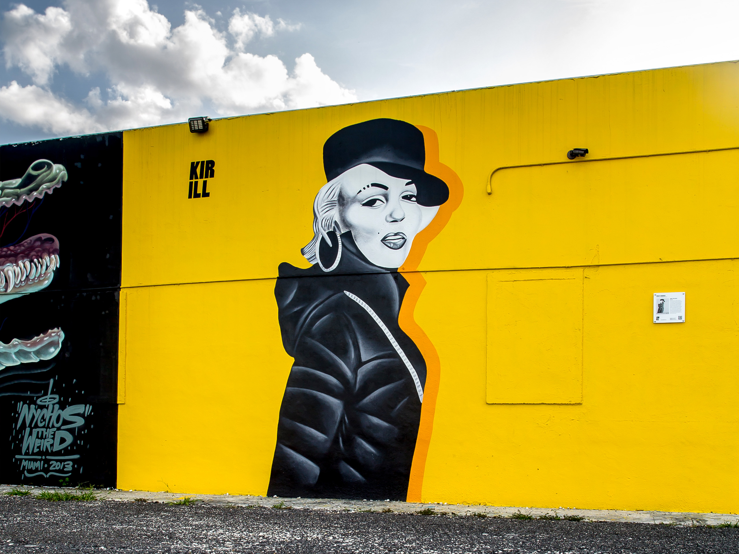
For years, I believed that good work would eventually speak for itself. It doesn’t. At least not if nobody sees it. A while back, I started sending samples of my artwork and design work directly to property developers, business owners, and organizations whose spaces...
Read More
AI Doesn’t Make You More Creative. It Makes You More Efficient.
- in AI Workflows
One of the biggest misconceptions about AI creative tools is that they somehow make people more creative. They don’t. What they do exceptionally well is accelerate parts of the creative process that once took hours, days, or even weeks. Research, brainstorming, concept exploration, content...
Read More
Born from Skate Culture
- in Branding
I designed the Kirill logo in 2011. At the time, I wasn’t thinking about personal branding or marketing. I simply wanted a mark that felt authentic—something bold, memorable, and unmistakably mine. The inspiration came from the skateboard culture I grew up with in the...
Read More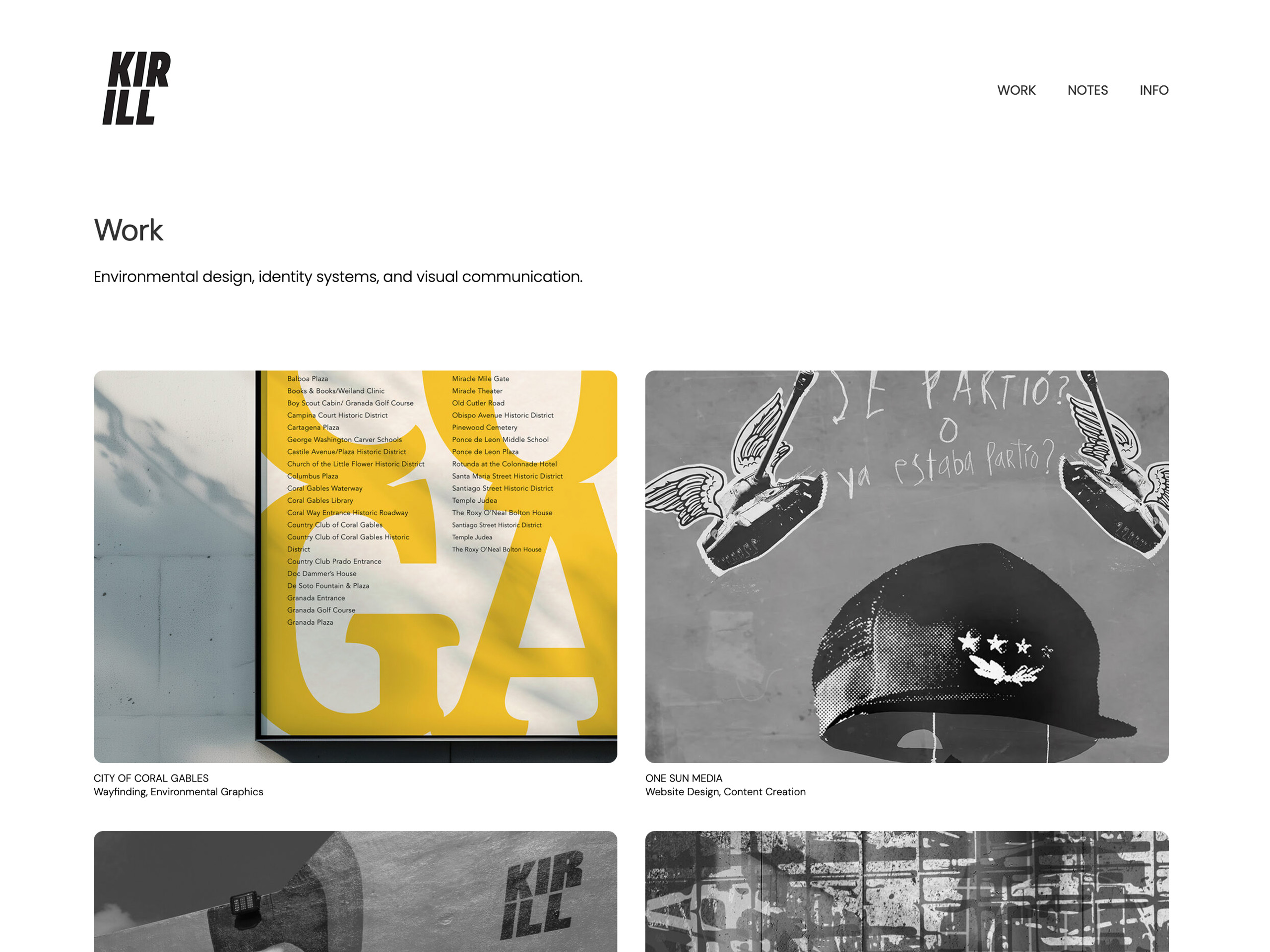
Why Better Portfolios Often Show Less
One thing I’m learning while rebuilding kirilldesigns.com: A portfolio is less about showing more work and more about directing attention. I used to think stronger portfolios needed more projects, more thumbnails, more proof. Now I think the opposite. The best portfolio sites feel edited....
Read More